Your project's Light/Dark design tokens in one place — colors, fonts, radii, and component styles — previewed live and fed automatically into every screen the AI generates.
Editing tokens
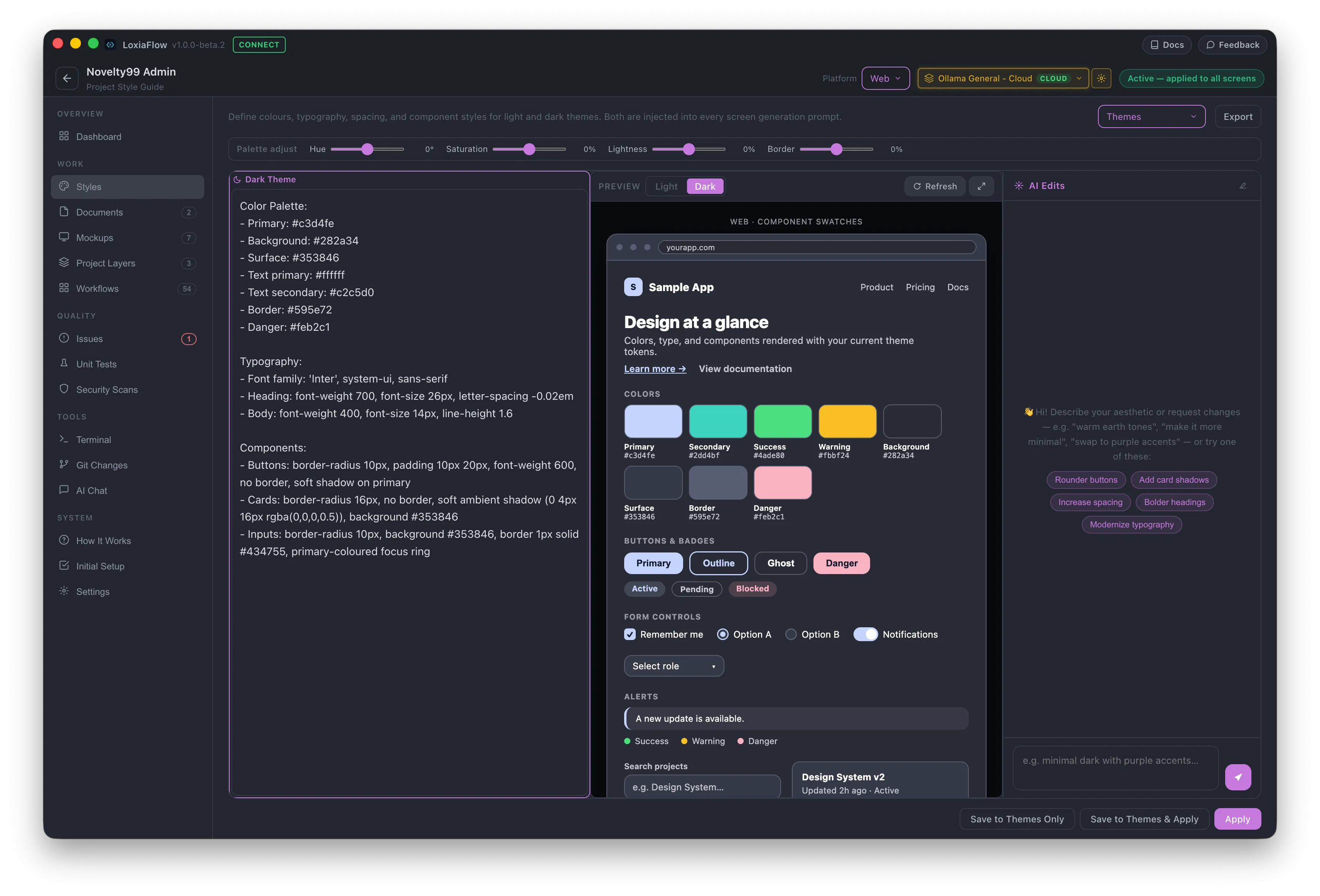
Two free-text panes — Light Theme and Dark Theme — hold your design tokens (colors, fonts, radii, component styles) as plain structured text. A live preview panel renders a mocked UI (web browser chrome, or a phone frame for Flutter/Android target platforms) parsed from that text, with a light/dark toggle and an Expand focus mode.
Built-in presets
A Themes dropdown offers ready-made starting points — Ocean Blue, Forest Green, and Minimal Mono for web; Neo Graphite for mobile/Material — plus a platform-appropriate Default Template. Picking a Flutter or Android target platform automatically appends a Material-specific guidance block (phone framing, elevation shadows, touch-target sizes) to whatever theme you load.
AI Edits
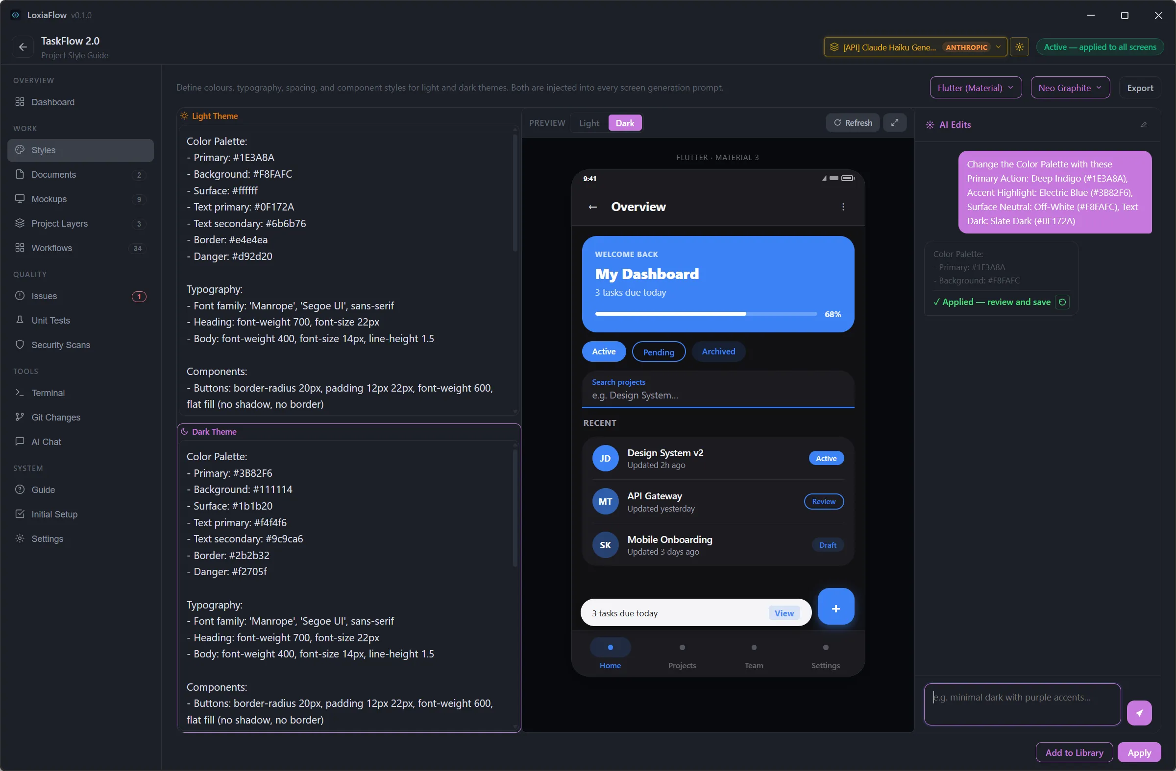
Describe a desired aesthetic in the chat pane (e.g. "warm earth tones," "more minimal"). If you already have theme text, the AI is restricted to only replacing hex color values — every label, font size, radius, and spacing value is left untouched. With no existing text, it generates a complete theme from scratch. The result is applied straight into the textareas for you to review; a Revert button on that chat message undoes it if needed.
Saving
- Apply — persists the current Light/Dark text to the project (this is what Mockups actually reads).
- Add to Library — names and saves the current theme as a reusable entry in the Themes dropdown.
- Export — saves both themes as a Markdown file.